For my second User Experience class project at General Assembly, I was tasked with a solo project to design a micro site to focus on very specific users with 75-100 highly curated products from their current inventory. My objective was to work with the information architecture and interface design to produce a site which is easily navigable by the user and conveys the brand’s image. The time frame for this project was two weeks.
Tools
- Illustrator
- Indesign
- Axure
- Photoshop
Methods
- Company Website Analysis
- Competitive Analysis
- Card Sorting
- User Flows
- Site Map
- Sketching
- Wireframes: low-, medium-fidelity
- Prototyping
- User Testing
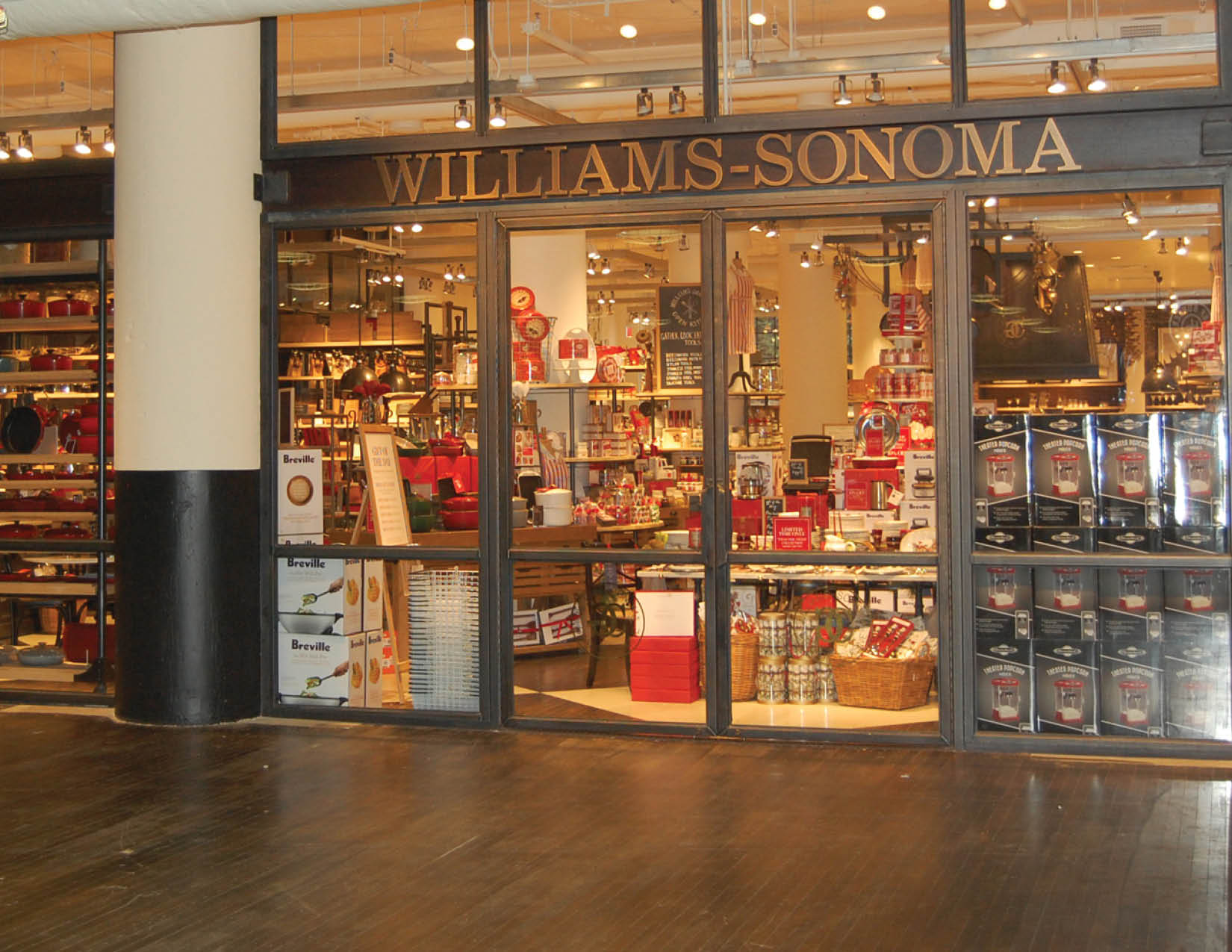
Williams-Sonoma’s Website
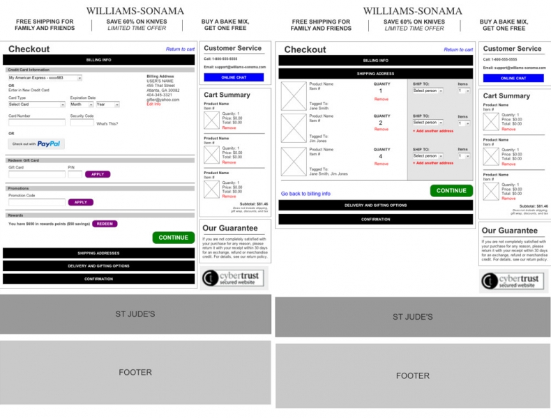
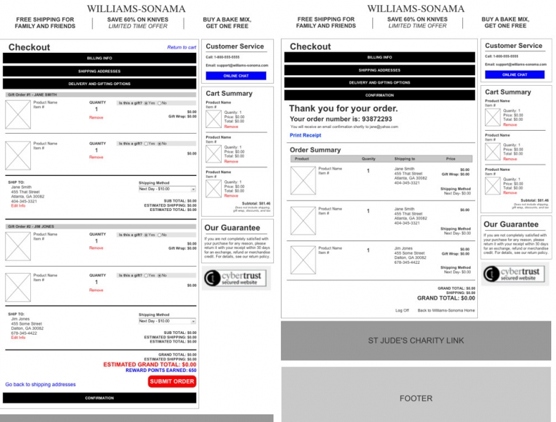
In reviewing their site, the site was nicely designed and organized. However, I found several pain points in the checkout process. A couple revisions/additions would be needed to improve the experience and make it more pleasurable.
My Plan
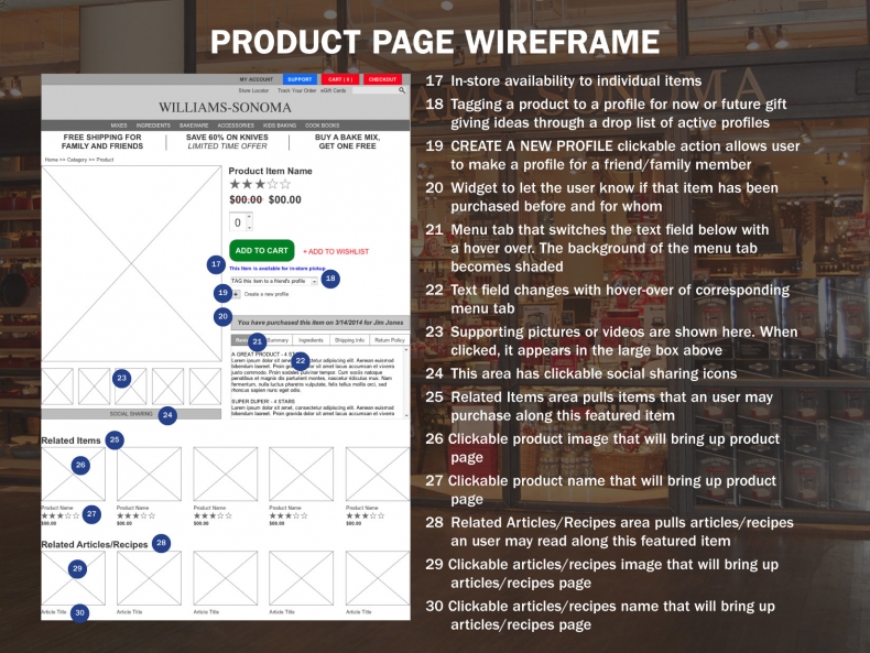
For the theme of this micro-site, I decided build a bakery site with a feature allowing the user to create profiles for their friends/family. The feature would allow the user to record gifting dates, like birthdays, mother’s day, etc and send reminders to the user. It would store purchase history, bookmark possible future gifts and suggest gifts from those items.
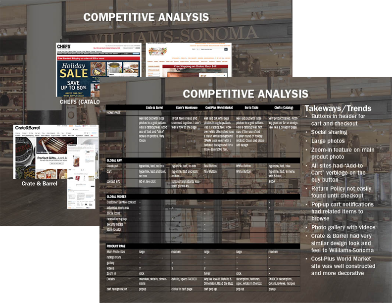
Competitive Analysis
I began researching five competitors. Crate & Barrel, Cook’s Warehouse, Cost-Plus World Market, Sur la Table and Chef’s (Catalog).
Card Sorting
I performed a card sort of approximately 100 products to determine how the products should be classified into categories. Then, I performed open and closed card sorts to validate. My findings was I needed to rename the category dealing with kids’ baking items.
Persona
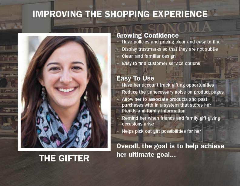
Of the three personas provided, I decided to use the persona of the gifter. The points in yellow were the items I focused on for her journey.
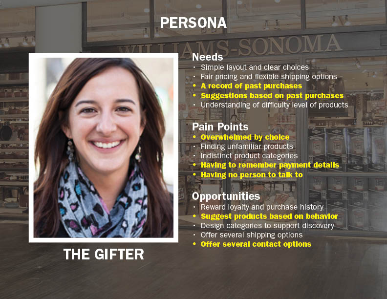
After merging the takeaways from the competitive analysis and the persona’s needs, pain points and opportunities, I decided on how to improve the persona’s shopping experience.
Sketched Wireframes
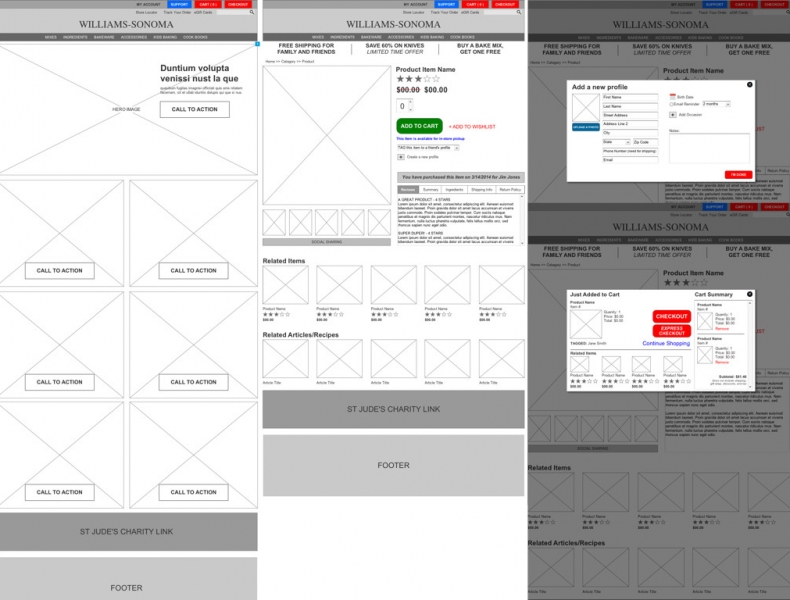
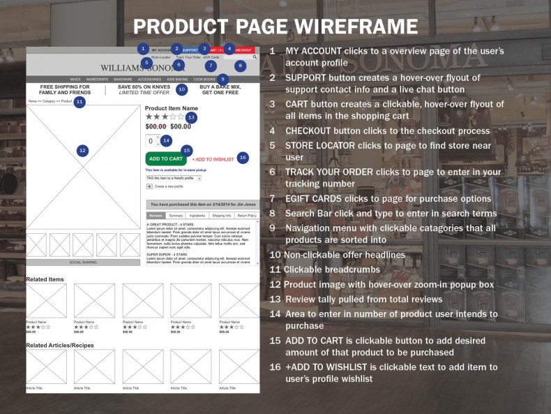
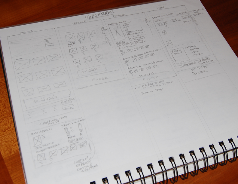
Once I was finished evaluating my research and findings I started sketching my wireframes then I began building my medium-fidelity prototype in Axure.
User Testing/Iterations
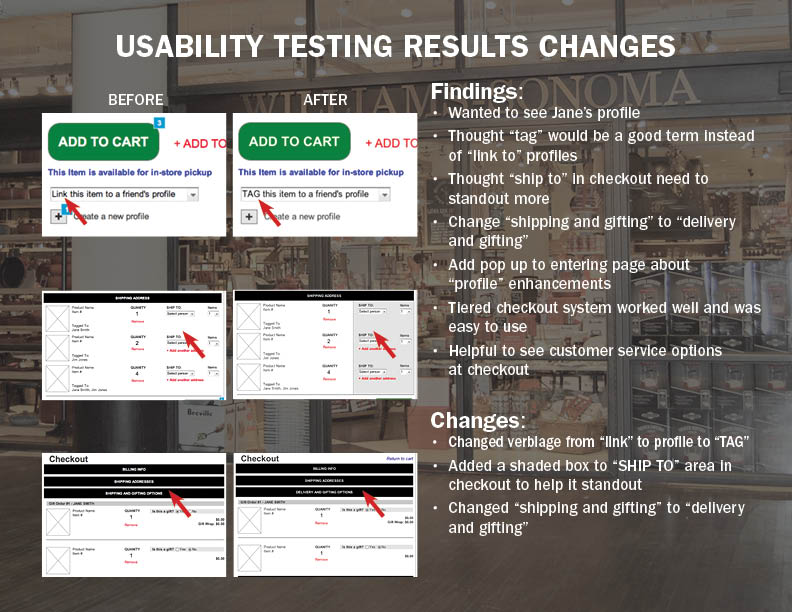
After going through a round of user testing, I was very happy with the results. I had a couple of changes but overall, I was very close to a final prototype.
Wireframes
