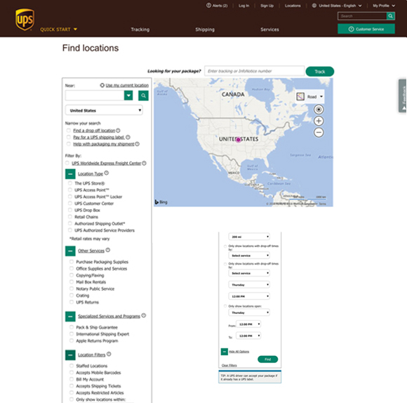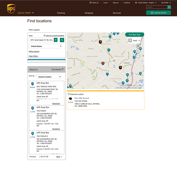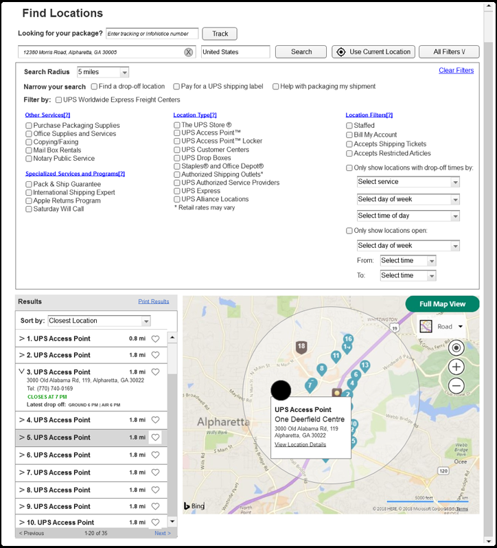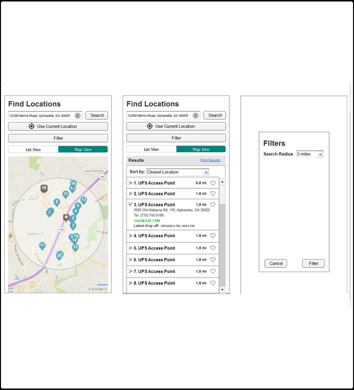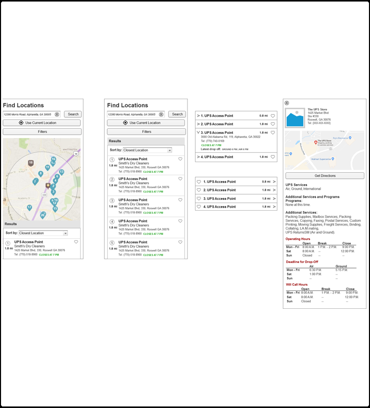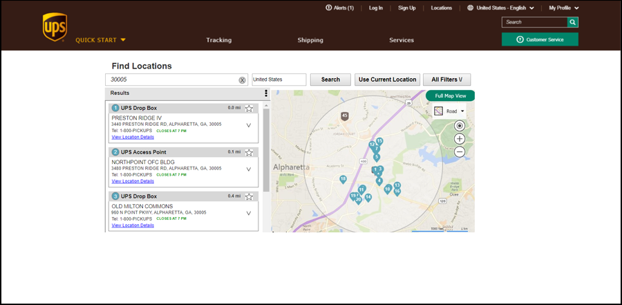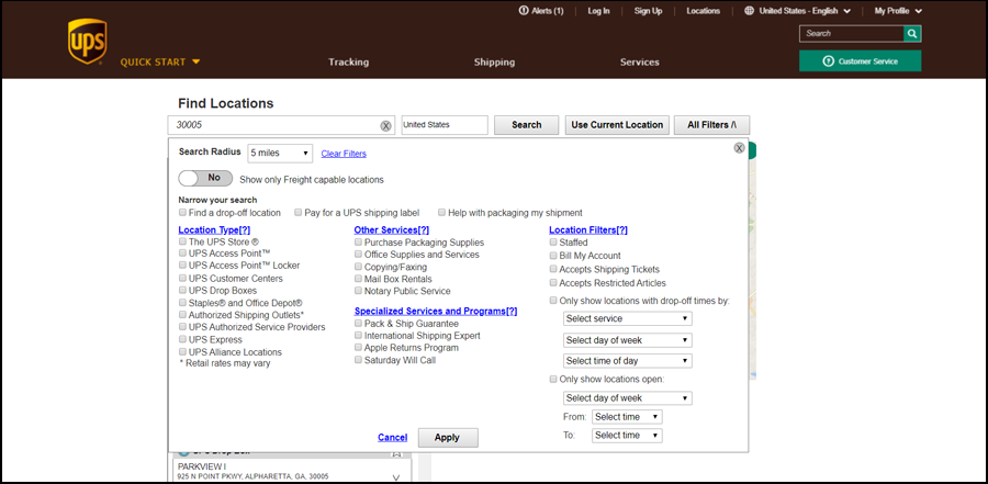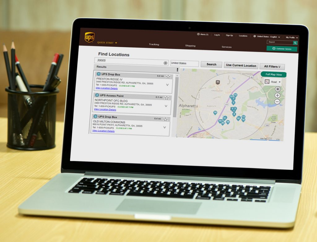
The UPS Global Locator identifies UPS locations based on location and user needs. Our group found that the current locator had accessibility issues in the search/filter section (see below). The filters are located in individual drawers which are not readable by screen readers. Since we needed to address this issue, the leadership decided to also evaluate the entire experience and possibly pitch a redesign of the locator to the business.
Research/Analysis
Heuristic evaluation: I wanted to evaluate the current interface and document potential design issues, including the following. Some initial pain points or questions I had on the design was:
• Illogical filter organization
• Cumbersome user interaction for filter selection
• Usability issues with “Clear Filters” and “Tip Box” features
Google Research: I started by researching best practices and trends for locator sites, GPS locators and various filtering models, (locators/e-commerce). From this research, I was able to gather some ideas on how to best evaluate our site and compare it to others.
Competitive Analysis: I analyzed several businesses with many locations like UPS and also other sites that I felt had good search experiences including x, y and z.
Meet with UX Lead
Received guidance on some internal tips to possibly address while evaluating the experience:
- Table vs Tiles (currently UPS is installing a new design on viewing information points)
- Filtering display
- UI design for stacking / collapse to MVP and SVP (look at mobile) and how phone list loses map
- Touch based triggers for all actions
Takeaways
- Use auto locator to take away a step from the user. This helps the user move faster and simulates your phone mapping app.
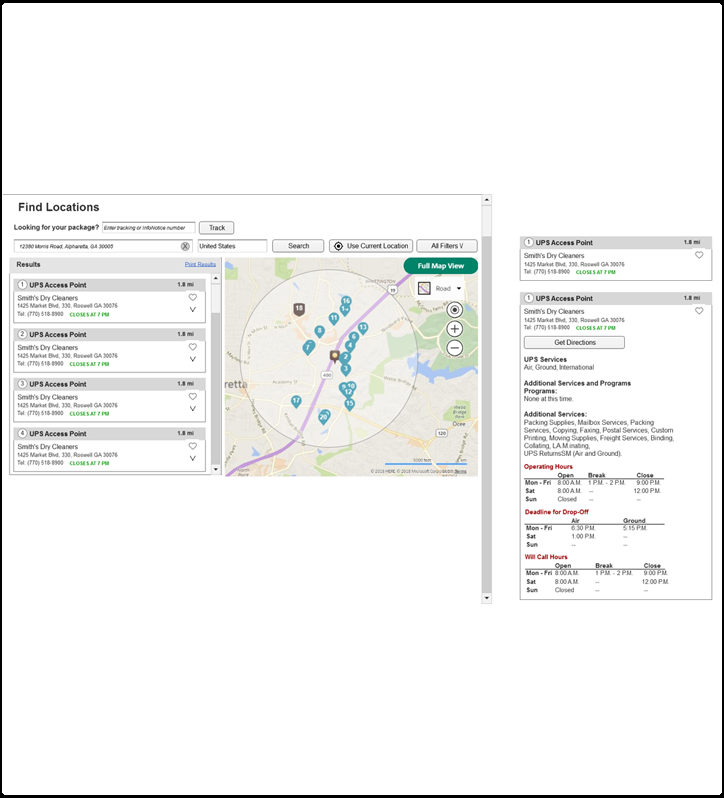
- Sharing directions to phone text/email helps user with less steps to use driving directions
- Interactive map that populates more locations as you click and hold to move on the map. Move the map removes the need to for another close by search.
- Top down filter menu would help with less scrolling, instead of a filter list on the left. Removing drawers would help with less clicks, giving the users an overall view of the filter choices.
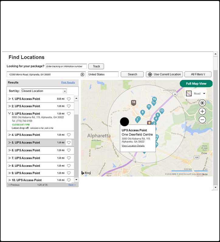
- Adding a favorites icon could help the user recall past location selections for an user with an account.
- Using a radius circle is helpful to give the user an idea what a x mile radius search looks like.
- Centralizing the info on one page with directions would be easier on the user.
- When highlighting the location on the list, changing the appearance of the icon on the map would make locating that easier.
Design
Based on my takeaways, I started designing wireframes in Axure. I laid out a couple versions for desktop and mobile experiences. I wanted to review a couple of mobile interactions to get feedback from the group. My main goal was to get to an UPS location quick and easy, with minimal clicks. I put together the presentation, showing my research, site examples, opportunities, pain points, takeaways and my wireframes. After receiving feedback on my first redesign, I made a new round of changes (see below) then followed up with an in-house developer to review the style, functionally and accessibility. After his feedback, I made more changes and made a prototype for testing.
User Testing
We tested 10 users to see how they would use the current desktop interface compared to the desktop prototype. We tested them on finding an UPS store and finding a UPS freight location. Also, we asked them to apply a filter in the last drawer of the filters to see how they interacted with the current filters and see how they may compare the two filter experiences without being prompted.
We are currently reviewing the results of the User Testing. The main takeaways from the testing was:
- Look at moving Freight filter under “Location Type”, because people started looking under that “Location Type” header instead of the top of the filter section
- People used the website search option because they couldn’t find (or quit looking for) a filter choice
- People sometimes missed a filter option because they didn’t in the correct drawer or didn’t open all the drawers
- People felt showing all filter options was the better option (Prototype layout)
- Some people prefer looking for a location using google or map app. This could be an opportunity to focus on SEO of the global locator page.
While the results seemed to favor the prototype, there are some adjustments we need to make and some questions we need to ask the business to proceed.
Next Steps
Below are some things, I would have done to do complete this project.
- Surveys/User Interviews – I would like to find out who exactly is using the locator on the UPS site. My thoughts are people, like myself, may use google maps or phone map to find UPS points before using the UPS locator. Are they outside users or users with an account? Are they individuals or businesses? What do they think of the current experience? Do they think about the filters?
- Develop personas and their journey to the locator.
- Find out business reasoning on filters and other parts of the experience. I feel the filters need to have less options. In my initial research, no other sites had this many filters.
- Apply findings to mobile version
- Regroup with development team, to get feedback on updated desktop and mobile designs.
- Another round of user testing to validate.
