Part One – Review and Evaluate Discover’s Current Application Process
When I first joined the Discover Personal Loan (DPL) UX team, my initial task was to review the current loan application process\ and provide an evaluation. I was also asked to consider how a user might use the application for debt consolidation and identify opportunities to increase applications for this purpose.
To approach this task, I started by reviewing the process with “fresh eyes,” intentionally minimizing any bias. Next, I watched recordings of users applying for loans to observe pain points and friction firsthand. Finally, I examined previous third-party critiques of the application process to compare with my own observations. I then integrated their suggestions where relevant or used them to support my feedback.
Some examples of critiqued pages
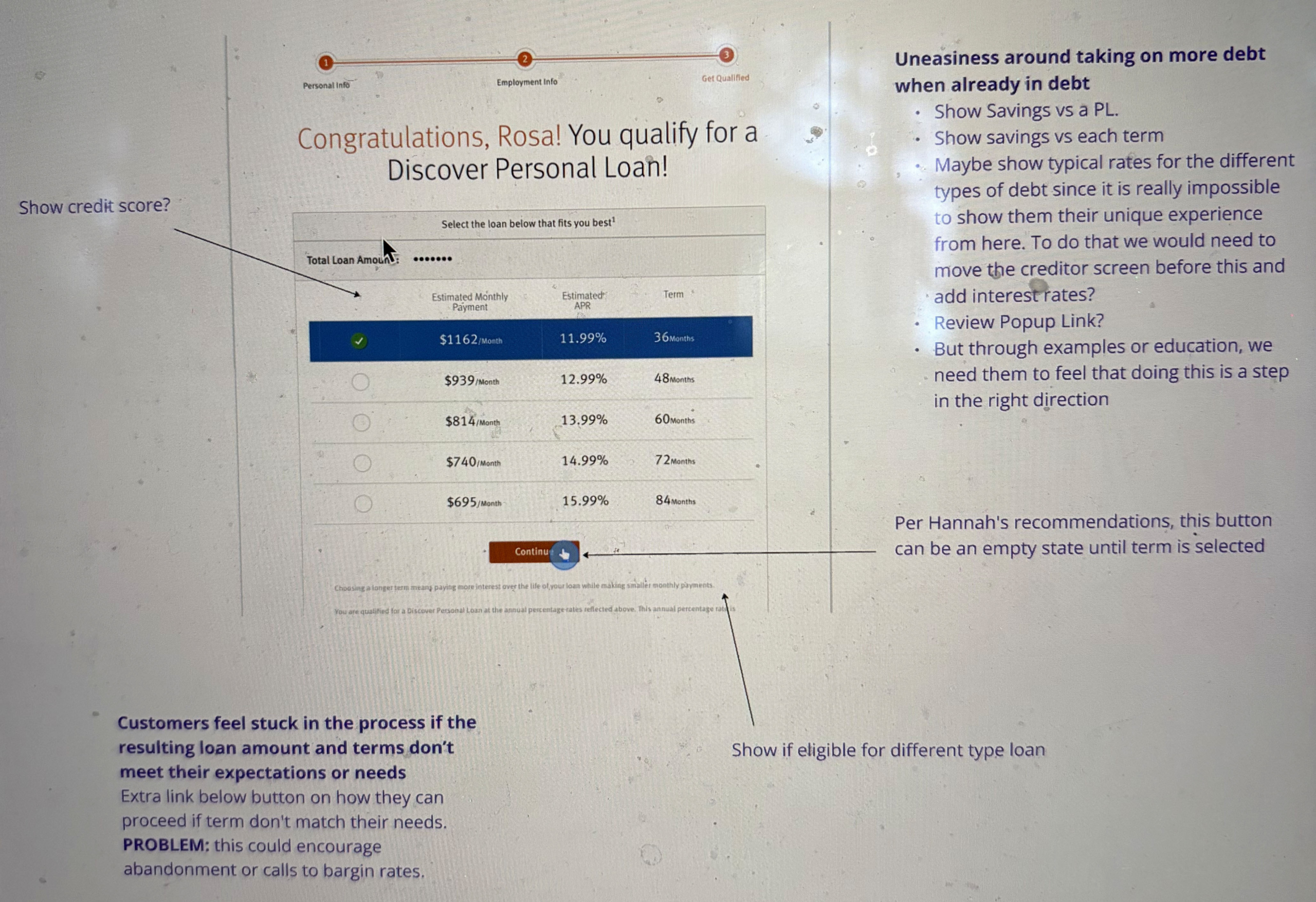
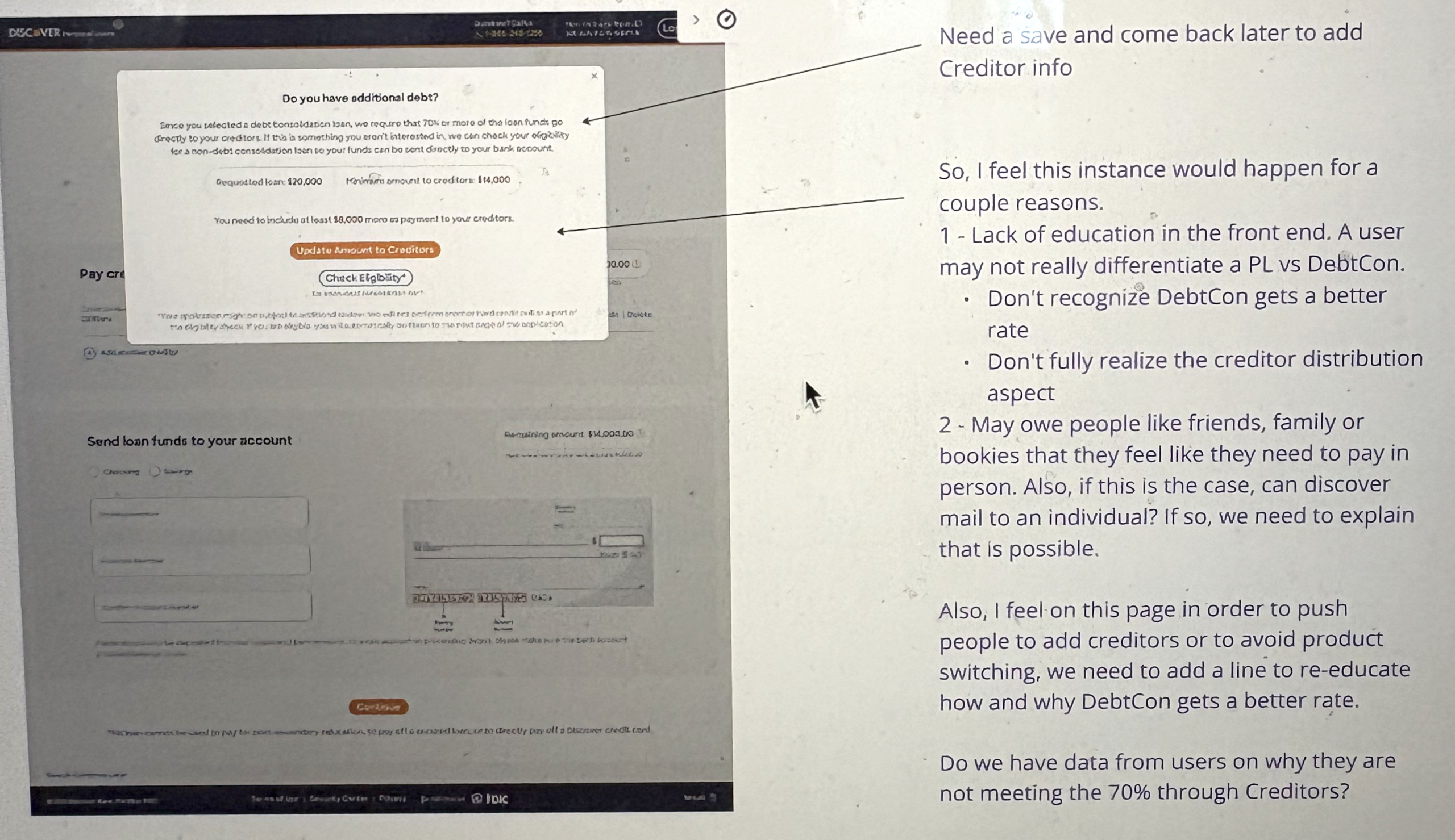
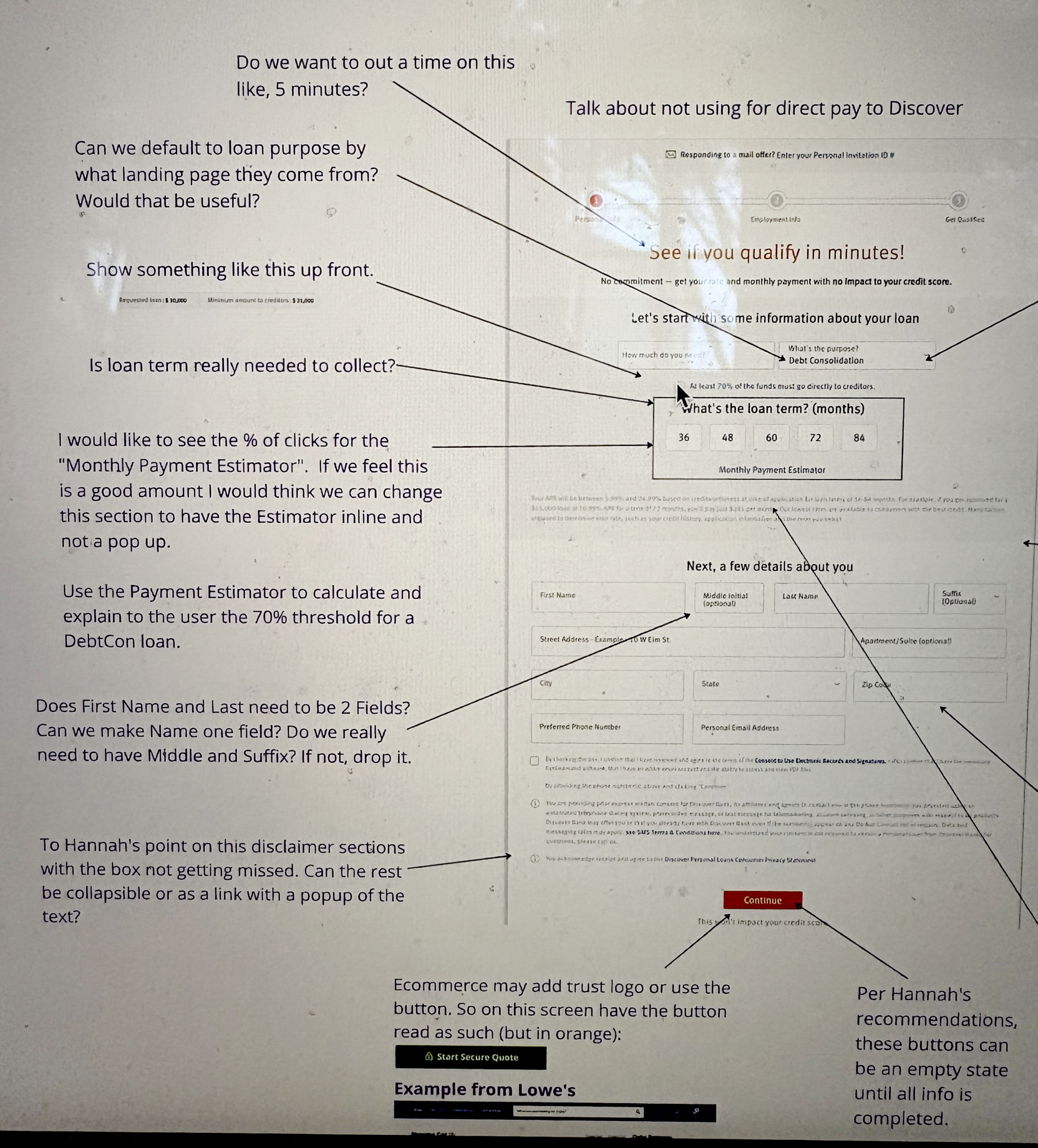
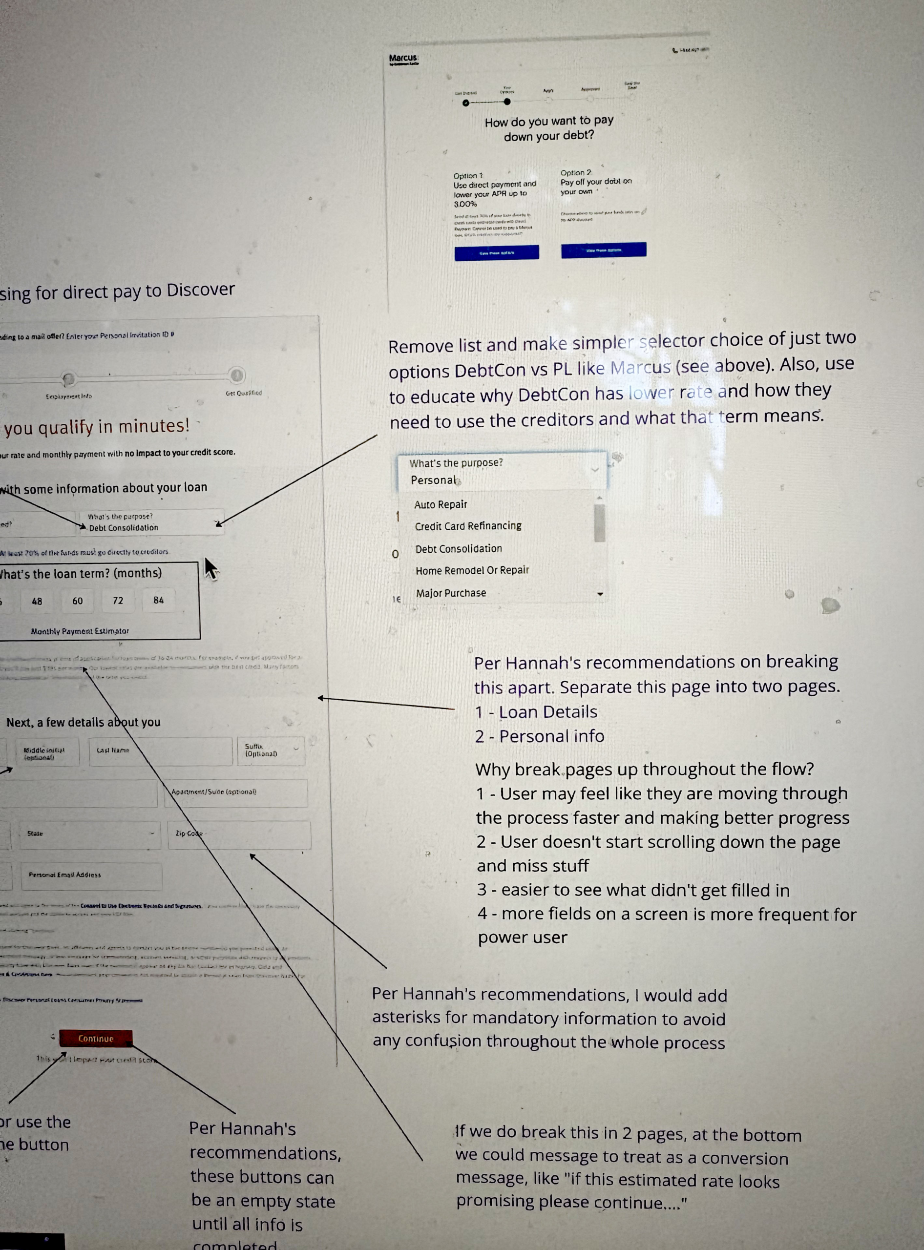
Some Findings from Discover Personal Loan Application Review
During my evaluation of the Discover Personal Loan application process, several areas were identified that could improve user experience and potentially increase application success, particularly for debt consolidation:
- Call-to-Action (CTA)
- The application begins with a “Check Your Rate” CTA. Users may not realize this initiates a loan application, which could decrease completion rates.
- Recommendation: Explore verbiage that better explains this begins the application process
- Loan Type Selection
- Users are not immediately given a choice between a standard Personal Loan and Debt Consolidation.
- Recommendation: Include an upfront screen with clear information and eligibility requirements for both loan types.
- Pre-Application Information
- Information about Debt Consolidation is limited before entering the application.
- Recommendation: Expand public-facing content to educate users about Debt Consolidation before they begin the application.
- Form Usability
- Long pages can cause users to miss required input fields.
- Recommendation: Break up the form into smaller, digestible sections to reduce errors.
- Dynamic Input Fields
- Selecting “Self-Employed” prompts a field for employer name, which is confusing.
- Recommendation: Dynamically change the field to request the “Business Name” when applicable.
- Terminology and Language
- Some terms were difficult for users to comprehend.
- Recommendation: Review language throughout the application to ensure clarity and simplicity.
- Application Flexibility
- Users currently cannot save progress.
- Recommendation: Add options to “Save and Continue Later” to accommodate longer or interrupted sessions.
- Data Entry Efficiency
- Users must manually enter bank, savings, and creditor account information.
- Recommendation: Enable self-populating fields where possible to reduce friction and errors.
After completing this review, I shared these findings with both leadership and the product team for consideration and discussion regarding potential enhancements, contingent on business priorities.
Part Two – Creating a User Flow Map in MIRO
The Discover Personal Loan (DPL) team managed multiple products alongside the loan application process, including features such as Manage Payments, Account Center Home, and Log In. We needed a centralized forum to visualize user flows for all our products—capturing user actions and decisions, corresponding Discover back-end processes, and up-to-date screenshots of each screen. This included variations for errors, warnings, and success states.
Taking the lead on this initiative, I began by mapping out the DPL application flow. This effort allowed me to create a framework and a reusable template for other designers on the team, enabling them to add their own products to MIRO efficiently. Once the DPL flow was completed and reviewed within the team, we shared it with Product Owners for feedback, allowing them to add back-end notes, suggest improvements, and ensure the map accurately represented the end-to-end experience.
Once finalized, the MIRO flow map provided multiple benefits:
- Team Reference: A centralized resource for designers and team members to consult when needed.
- Updating and Expansion: Screens and features could be easily updated or added.
- Resource for Presentations and Projects: Screenshots and information could be pulled or downloaded to support presentations, new projects, or ticket creation.
- Leadership Transparency and Learning: The map could be shared with leadership to provide insight into workflows and facilitate organizational learning.
Examples of flow map
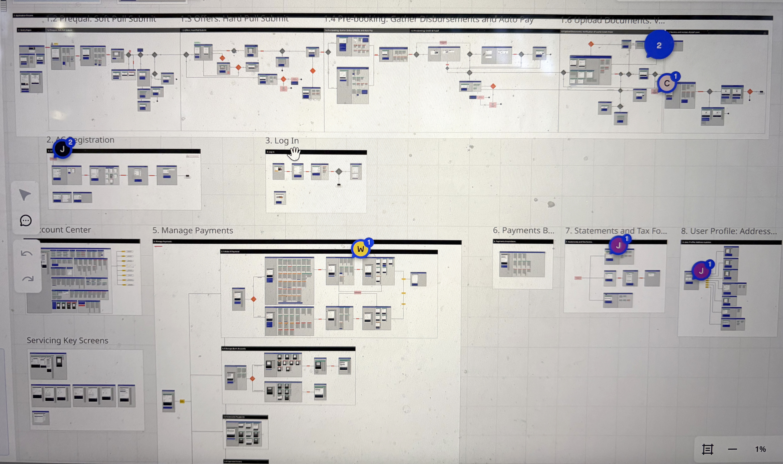
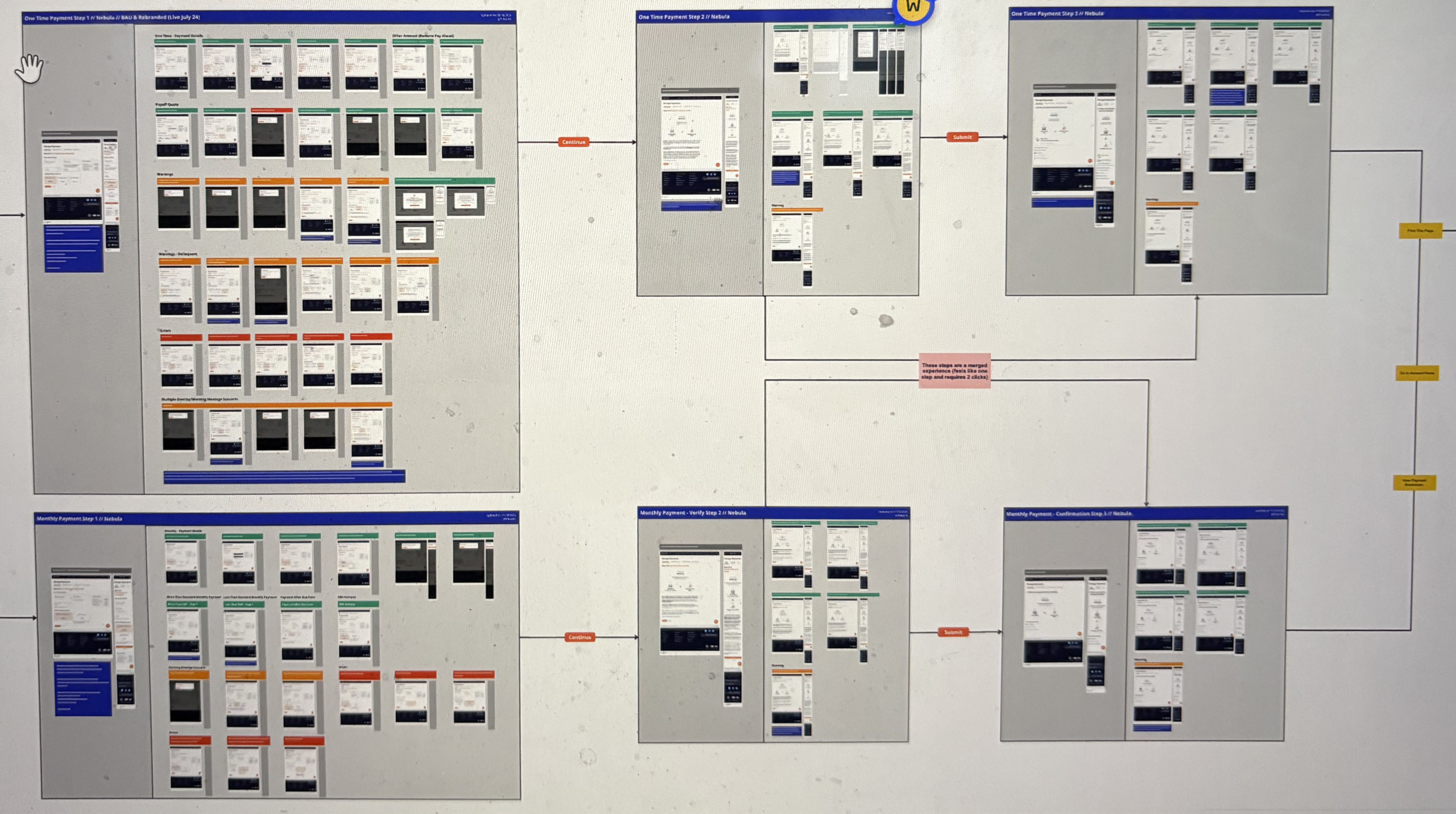
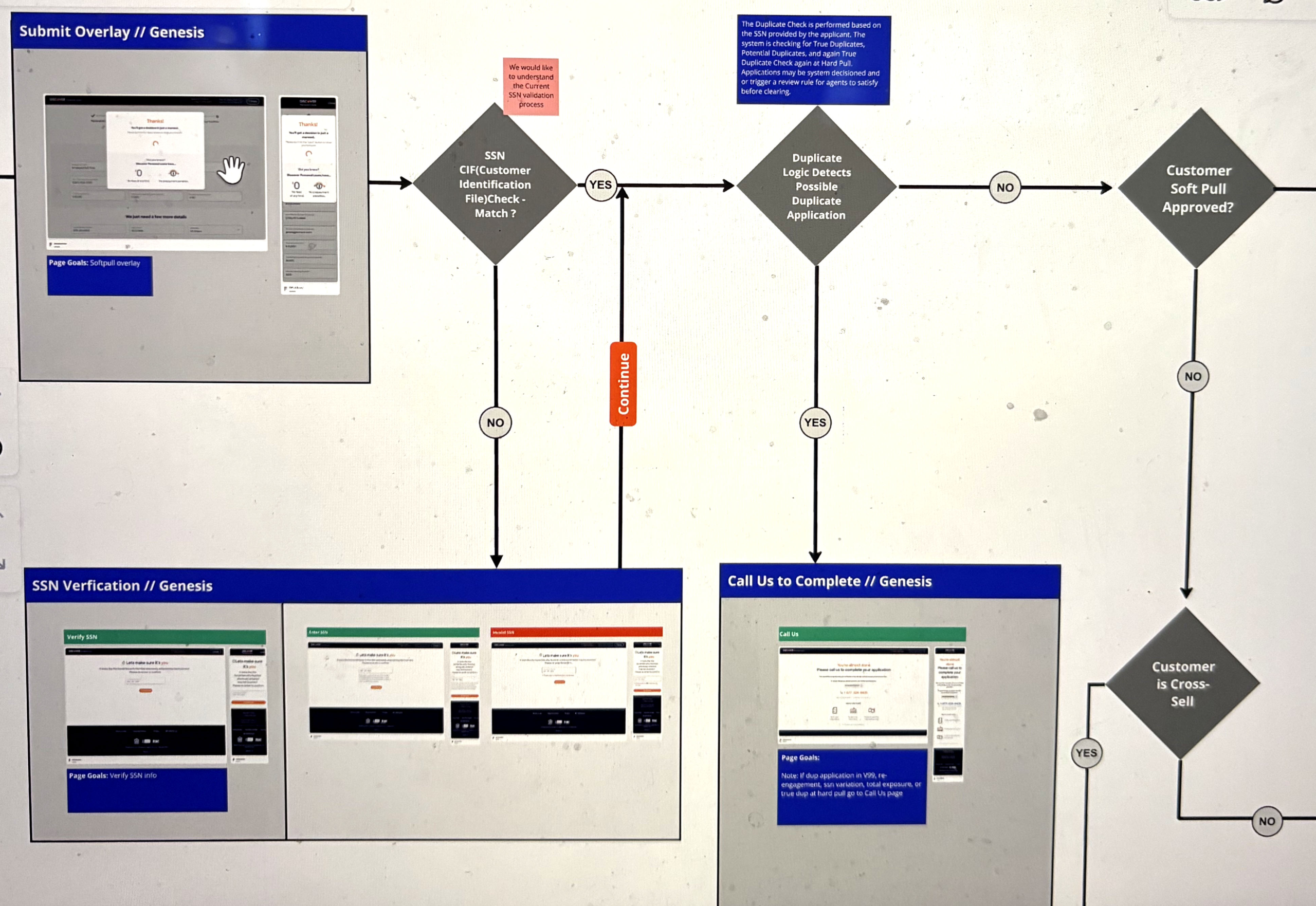
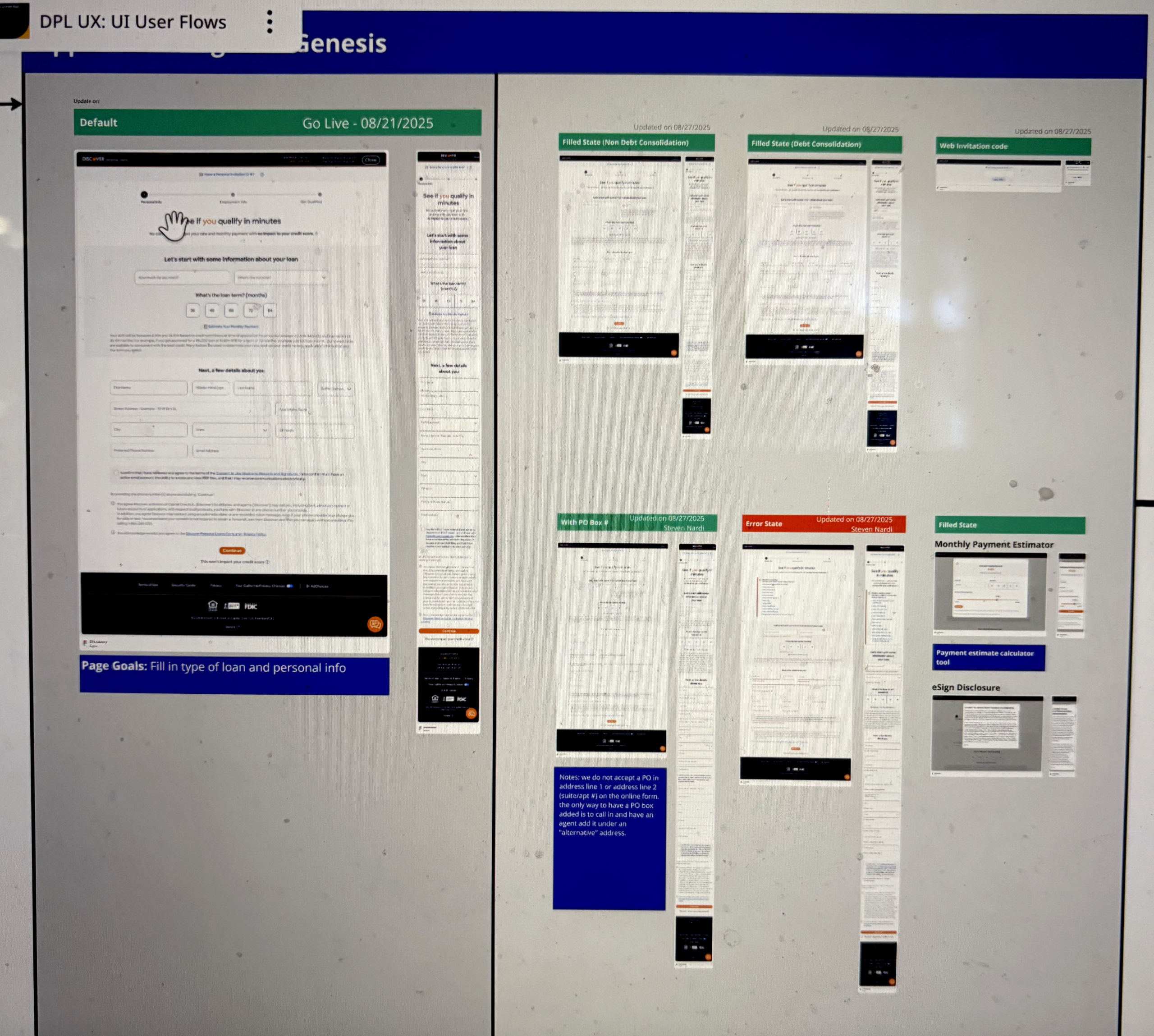
(products represented in different artboards)
Part Three – Reviewing and Critiquing Competitors’ Personal Loan Application Flows
The next phase of the project involved reviewing personal loan applications from Discover’s competitors. I went through the full application process for 11 competitors, documenting each step from the public landing page, through clicking the CTA, up to the point of loan acceptance. During this process, I took screenshots and noted highlights, including strengths, friction points, and unique features.
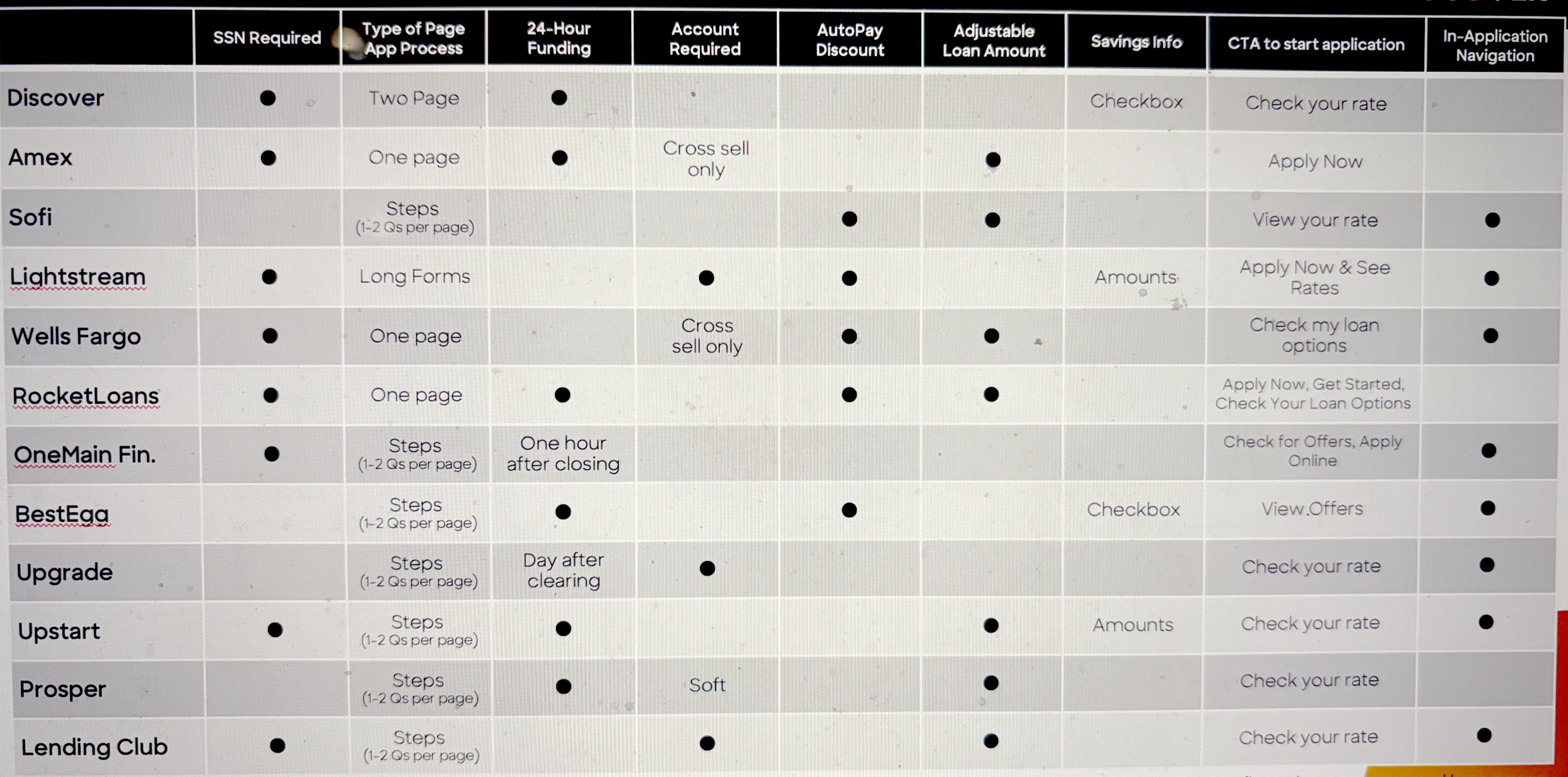
After completing this research and reviewing it with the team, I created a presentation to summarize our findings. For each competitor, I included screenshots of key screens, documented observations, and compiled a comparison table highlighting notable or top features. The overall goal was to provide leadership with insights into:
- What Discover is doing well
- Features and practices common across competitors
- Areas where Discover differs
- Opportunities for improvement
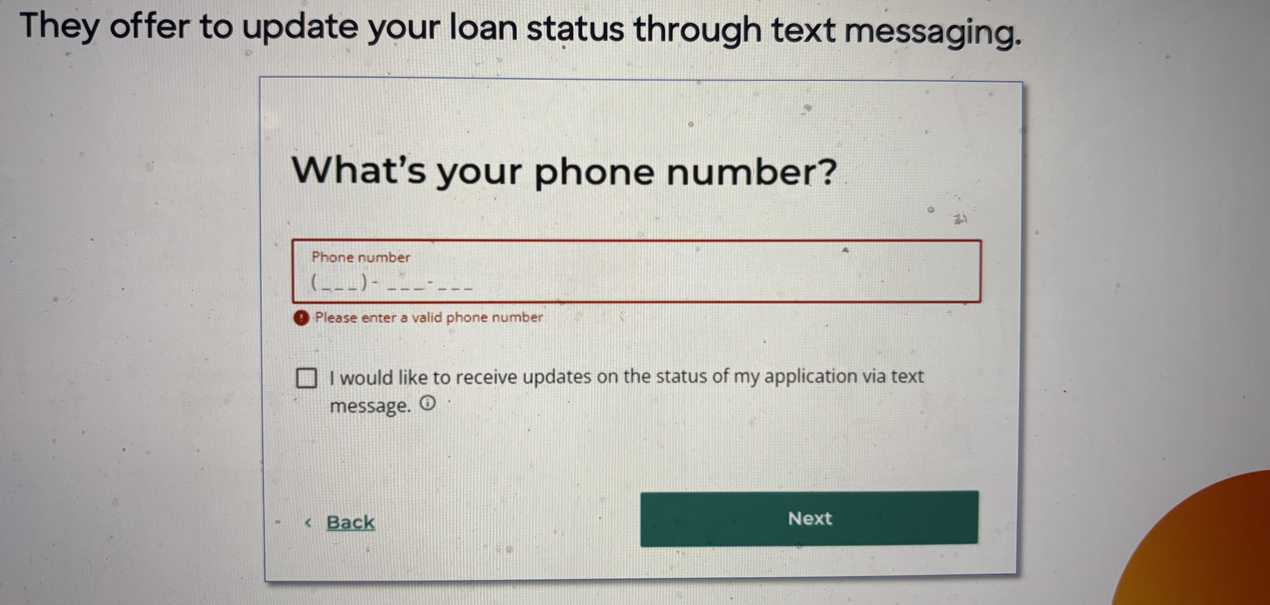
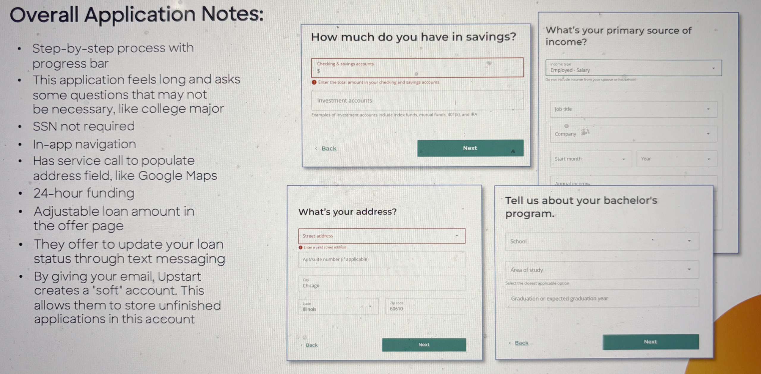
Sample user flow and notes for Upstart critique
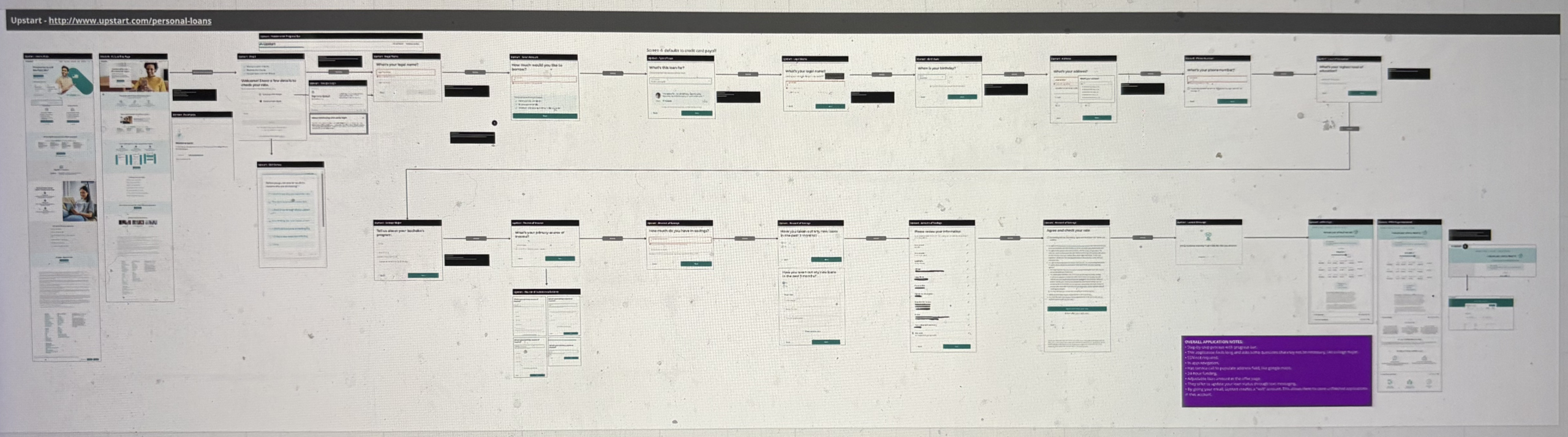
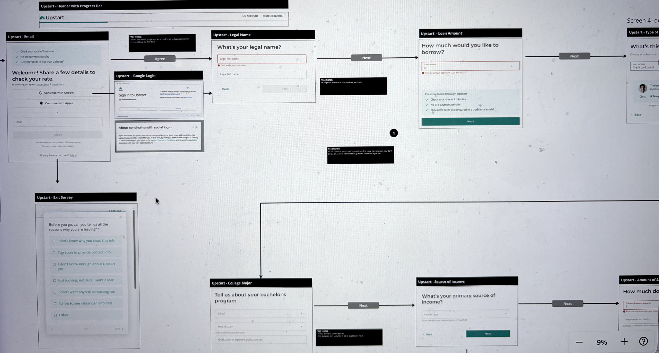
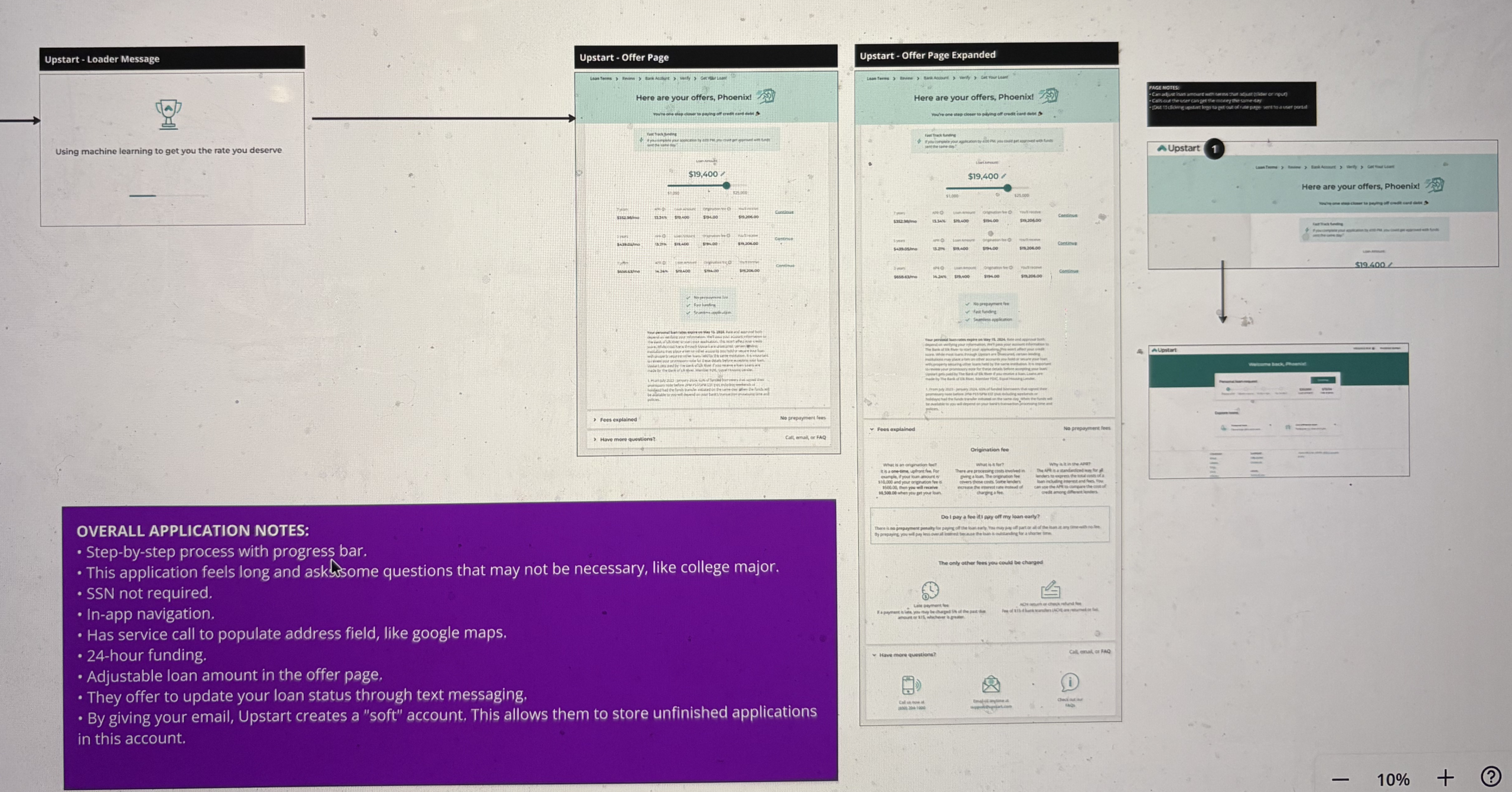
Presentation slides for Upstart critique
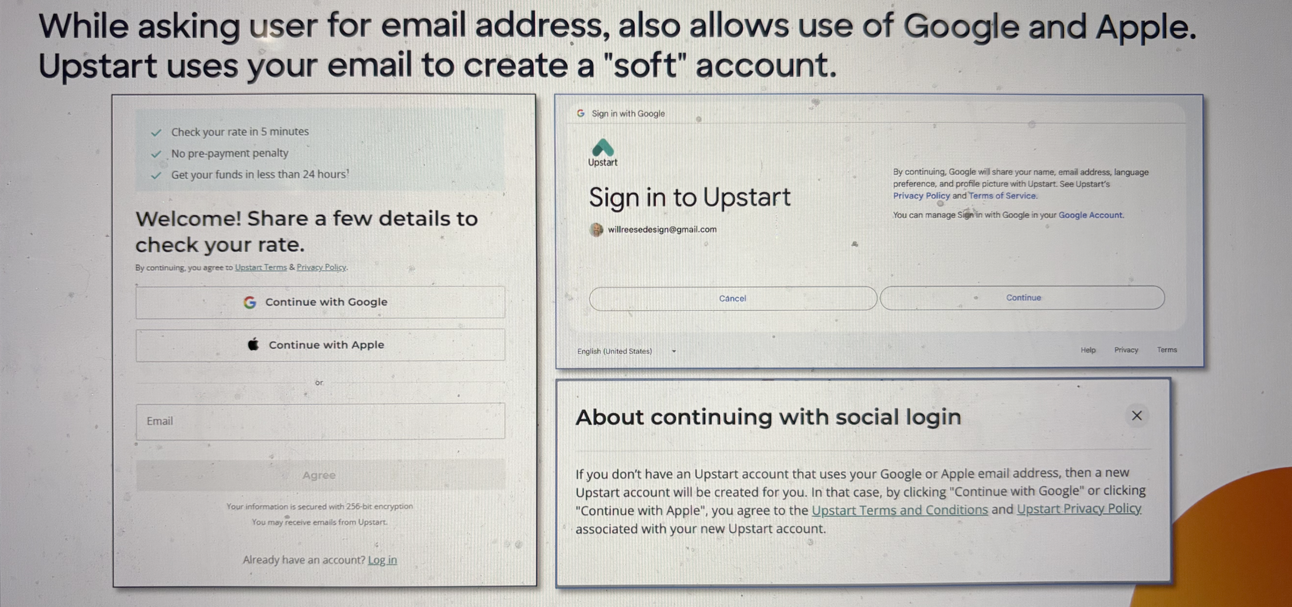
Following the presentation, I prepared for a series of workshops where we would review the Discover application process in the context of competitor insights. The objective was to identify enhancements that could improve the user experience. I successfully facilitated one workshop before transitioning to a full-time role on Discover’s Design System team. After my departure from the DPL team, the initiative’s focus shifted due to team bandwidth and the strategic priorities surrounding the Capital One merger.