For my third User Experience class project at General Assembly, my group was tasked with breaking CARE into mobile and finding new ways to reach donors and keep them engaged. Any app solution, though, would need to be integrated in some fashion with CARE’s current website and social media. The time frame for this project was two weeks.
Responsibilities
My responsibilities for this project included: project management, competitive analysis, brand analysis, journey mapping, wireframing, prototyping (low-, medium- & high-fidelity), user testing, user flows and presentation slides.
Team Members
- Audrey Griffin
- James Frierson
Tools
- Illustrator
- Keynote
- Axure
- Sketch
- Photoshop
- Marvel
- TypeForm
Methods
- Competitive Analysis
- Brand Analysis
- Surveys
- Personas
- Journey Map
- User Flows
- App and Site Map
- Sketching
- Wireframes
- Prototyping: low-, medium- & high-fidelity
- User Testing
CARE
CARE’s mission is to serve individuals and families in the poorest communities in the world. Facilitate lasting change by: strengthening capacity for self-help; providing economic opportunity; delivering relief in emergencies; influencing policy decisions at all levels; addressing discrimination in all its forms.
Our Plan
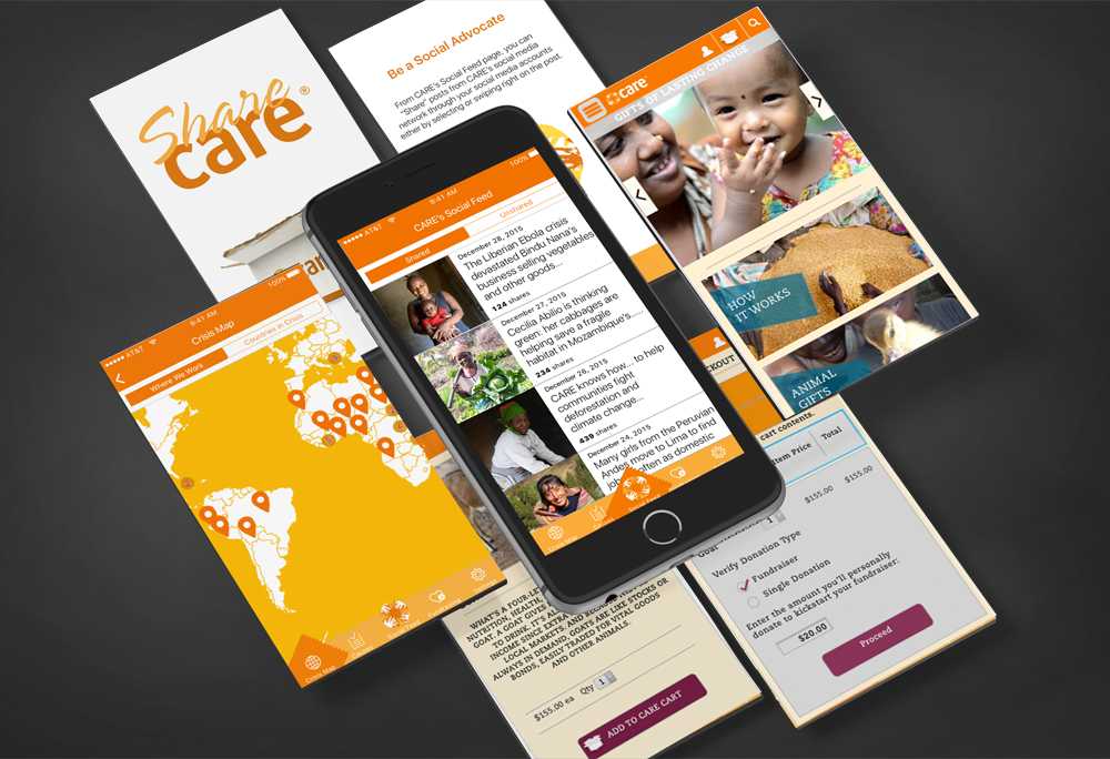
After our initial meeting, the team agreed on a path to build an app focusing on schools. The purpose is to educate children on the culture and areas affected by poverty and also to encourage fundraisers in the school systems.
Competitive Analysis
We set out to divide and conquer. We split up analyzing companies such as, WWF, UNICEF, Red Cross and Charity Navigator. We studied their business model, website, social media, apps and donation methods.
A Road Bump
While looking into the competitive analysis of other companies and various articles on the web, we ran across a huge obstacle. We discovered Apple has a restriction, no mobile app can have in-app donations. Plus, Apple takes off 30% of all in-app purchases. These two points pretty much killed our plans for this project.
Brainstorming
Realizing our idea was kaput, we started thinking about how to proceed. While we still was considering an donation function, the thought of making the user go from app to browser then making the user login to the mobile site, didn’t seem like the best user experience. After going back over the analysis, we started to focus on the difference in social media numbers for CARE compared to Red Cross, UNICEF and WWF. Our new idea was increase CARE’s social network by creating an app to share CARE’s social content the user’s social network in hopes that the user’s followers would become interested in CARE’s efforts and follow that page/account.
Research
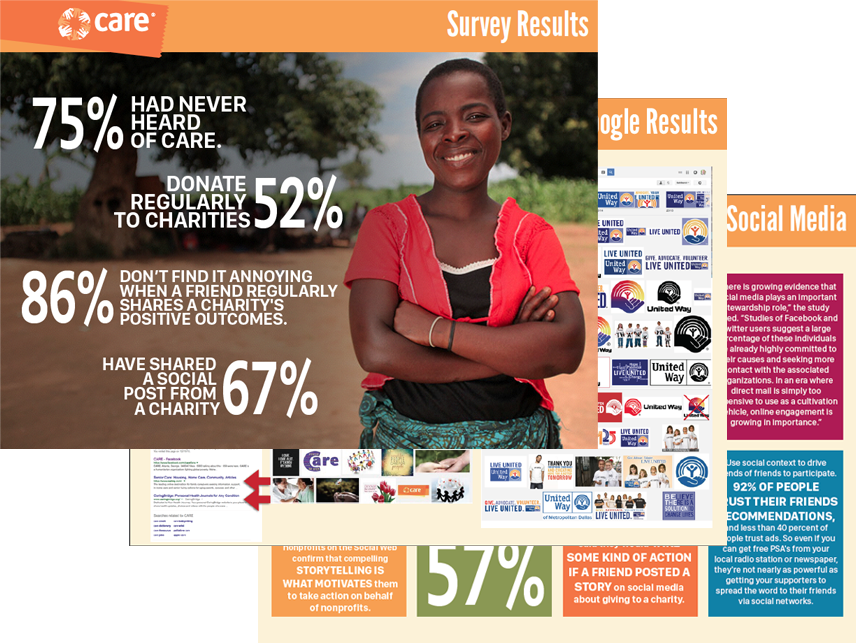
To validate this plan would work, we attacked different research methods. We looked into why the social numbers for CARE was low. Our initial thought for the low social numbers was brand recognition. We also researched the relationship between social media and charities and people’s thoughts on seeing information, stories and/or donation requests popping up on their timelines.
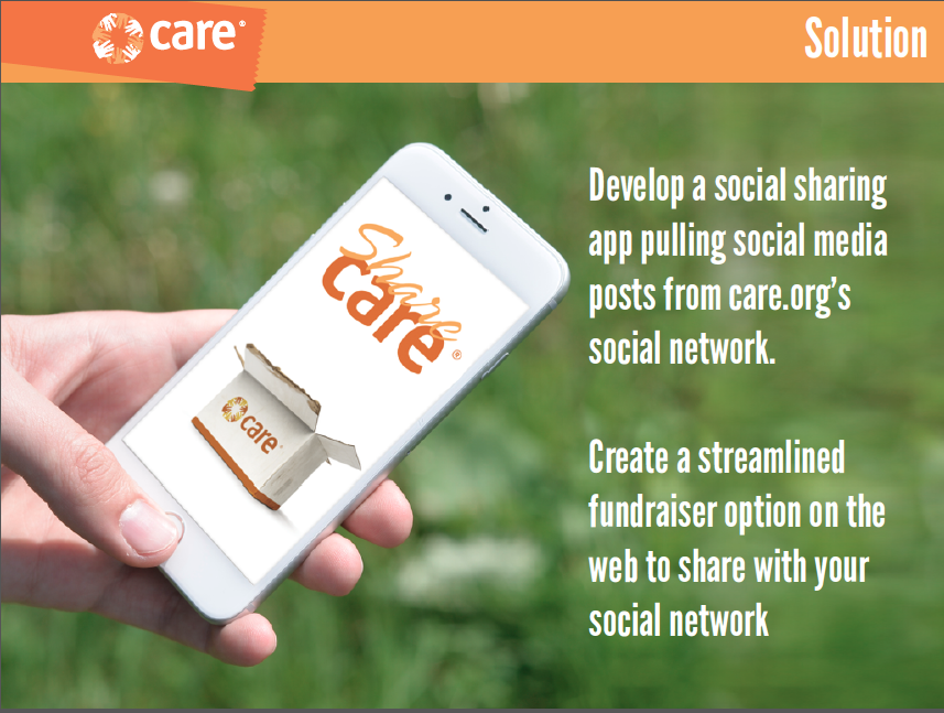
The Solution
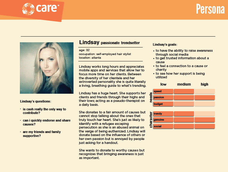
Persona
Looking over our research, we built three personas. For this project, we focused on the persona of Lindsey, a passionate trendsetter, who was looking for different ways to give back.
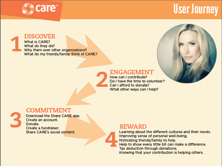
User Journey
We walked Lindsey through what her journey would be like to learn about CARE, find out what ways she could help, enlist in their cause and use her social network to heighten CARE’s brand awareness and social media presence.
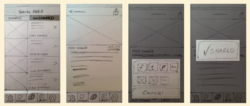
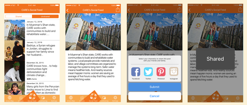
User Testing/Iterations
Once we sketched out our wireframes for the app and the mobile site, we began user testing. After five tests, we were very happy with the results. We found we needed to simplify the terminology, clean up our product page, clarify our social sharing options and remove a “skip” option in the on-boarding. After that iteration, we completed 3 more tests and was ready for a final prototype.
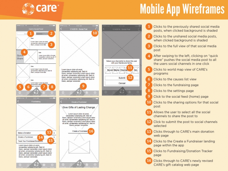
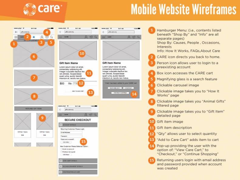
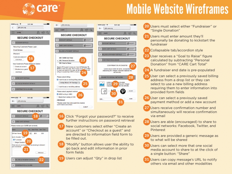
Wireframes