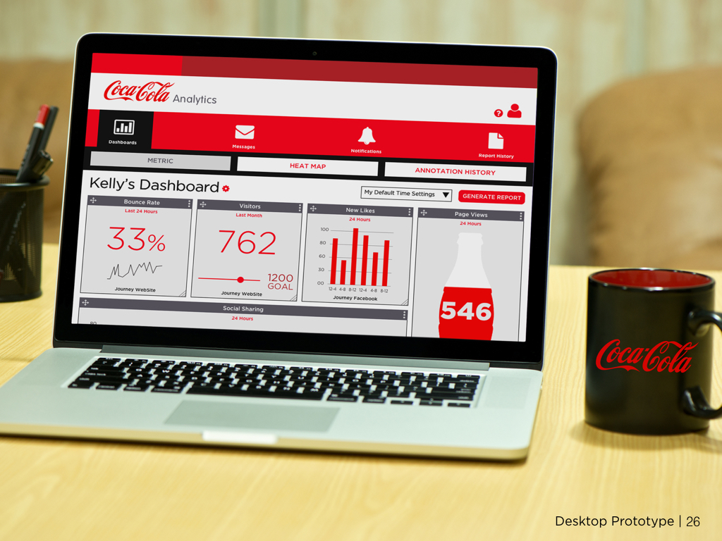
For my final User Experience class project at General Assembly, my partner and I were tasked with developing an analytics solution for Coca-Cola and its thousands of websites across its various brands and business units. Coca-Cola was in need of an analytics solution that can advise editorial and content decisions for its websites through effective data management and visualization. It must be easy to use, responsive, and implementable with as few resources as possible. Our time frame to complete this project was three weeks.
Responsibilities
My responsibilities for this project included: competitive analysis, user interviews, journey mapping, persona development, wireframing, prototyping (medium- & high-fidelity) and user testing.
Team Member
- Rachelle Jackson
Tools
- Illustrator
- Keynote
- Axure
- Sketch
- Photoshop
- Marvel
Methods
- Competitive Analysis
- User Interviews
- Card Sorting
- Personas
- Journey Mapping
- User Flows
- Site Map
- Sketching
- Wireframing
- Prototyping: medium- & high-fidelity
- User Testing
Competitive Analysis
We looked at several different types of dashboard platforms through web analytics (Google, KissMETRICS, GoSquared), off-the-shelf (Talkwalker, Klipfolio, Geckoboard) and business intelligence (MircoStrategy, Tableau, QlikView) options. Also, along with those examples, we looked at various design inspiration of analytic dashboards on sites such as Dribble, BEhance, Pinterest and various creative web articles.
Interviews/Card Sorting
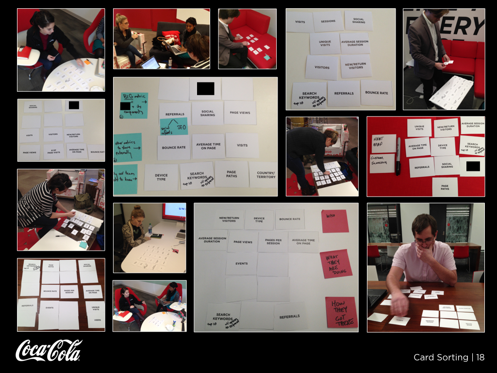
We conducted interviews with various roles within Coca-Cola to discover their wants, needs and daily processes. After those interviews, we conducted an unique type of card sorting. Each person picked their top ten metrics then constructed their own dashboard using those metrics.
Persona Development
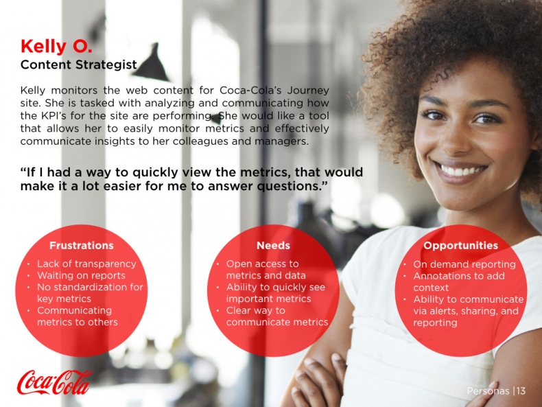
From our interviews, we built out three personas. For this project, we focused on the persona of Kelly, a content strategist, who requires a tool to allow her to easily monitor metrics and effectively communicate insights to her colleagues and managers.
User Journey
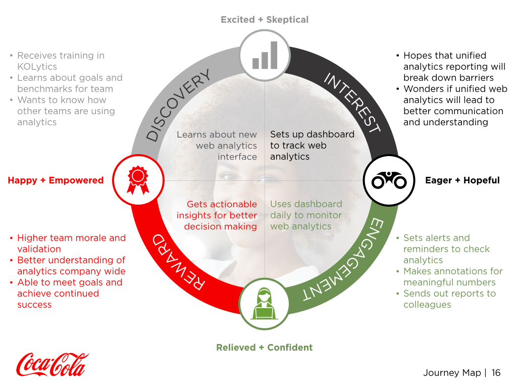
Below represents Kelly’s path from being introduced to an analytic dashboard tool to the daily use and acceptance along with the emotions she may encounter.
Wireframes
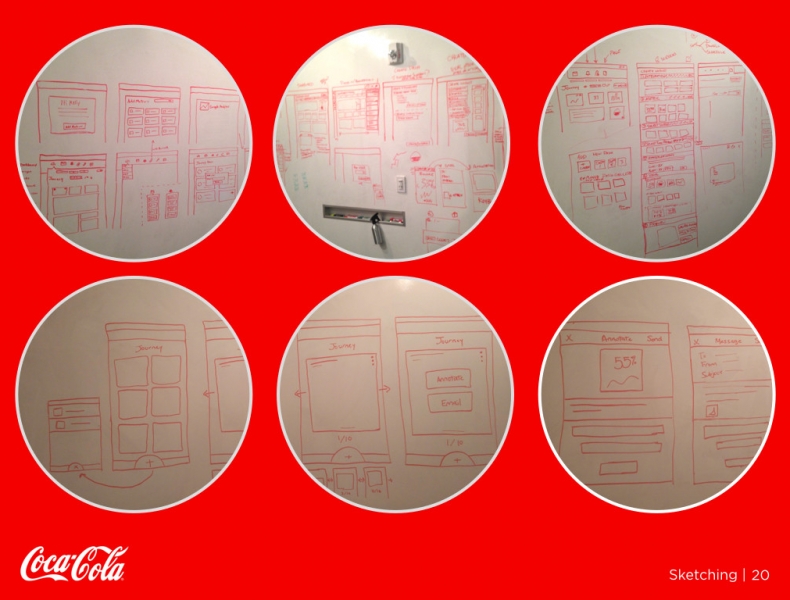
After compiling all our previous information, we took to sketching wireframes for the desktop and mobile web platforms. After transferring those sketches to a whiteboard, we merged our thoughts to one wireframe and began formulating medium-fidelity prototypes in Axure.
User Testing/Iterations
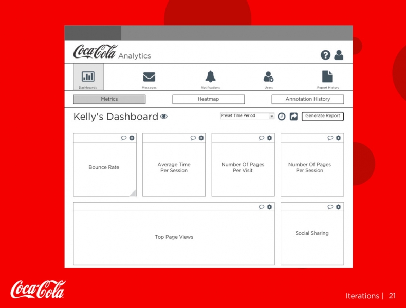
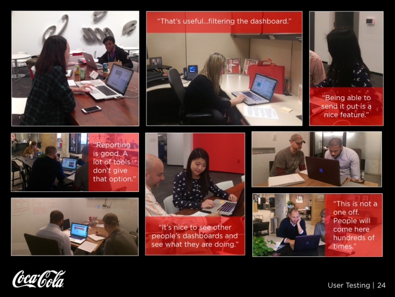
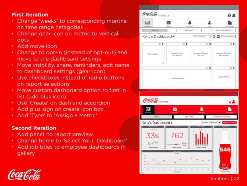
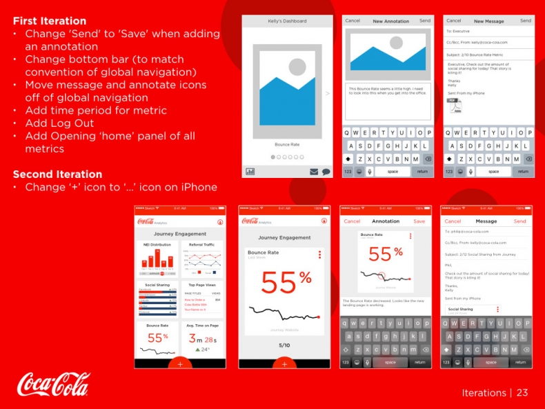
Once our medium-fidelity prototypes were finished, we began user testing. The changes mainly focused on cleaning up the dashboard menu options on the desktop version and adding an opening home panel of all the metrics to the mobile version. After incorporating our changes, we began building our high-fidelity prototypes in sketch and marvel. Those prototypes went through another round of user testing and with some minor changes, we had our final product.
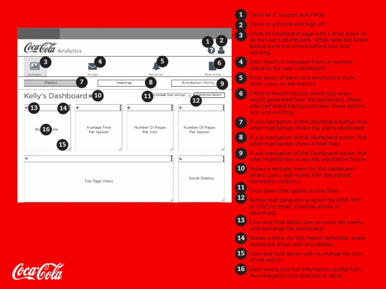
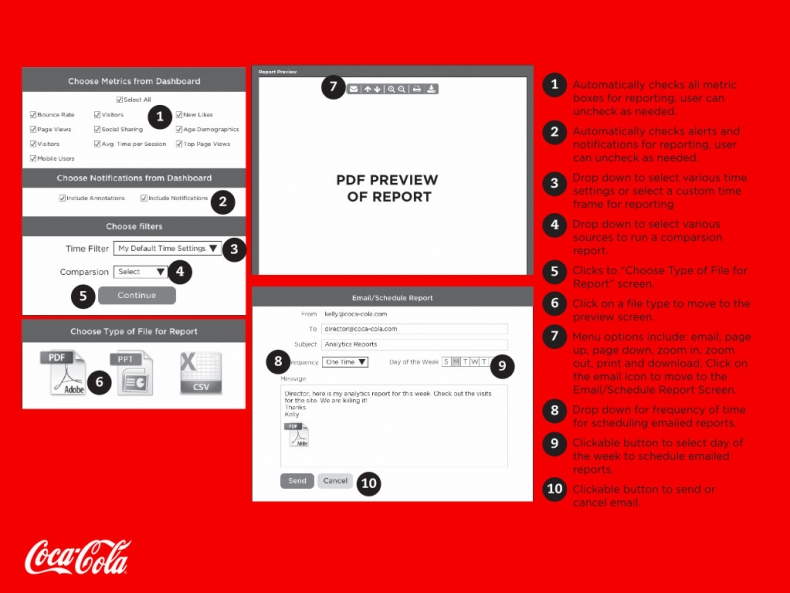
Annotated Wireframes
Desktop Prototype
Mobile Prototype
