I was tasked with creating a text area component that maintains consistency with our library, specifically aligning with our other form field elements. As with any component research, the starting point is reviewing four best-in-class design systems, followed by an examination of additional design systems we consider above average. I also referenced articles and accessibility standards to ensure compliance. Throughout this process, I documented my research to support the rationale behind decisions regarding the behavior and design of this component.
Key Items to Consider:
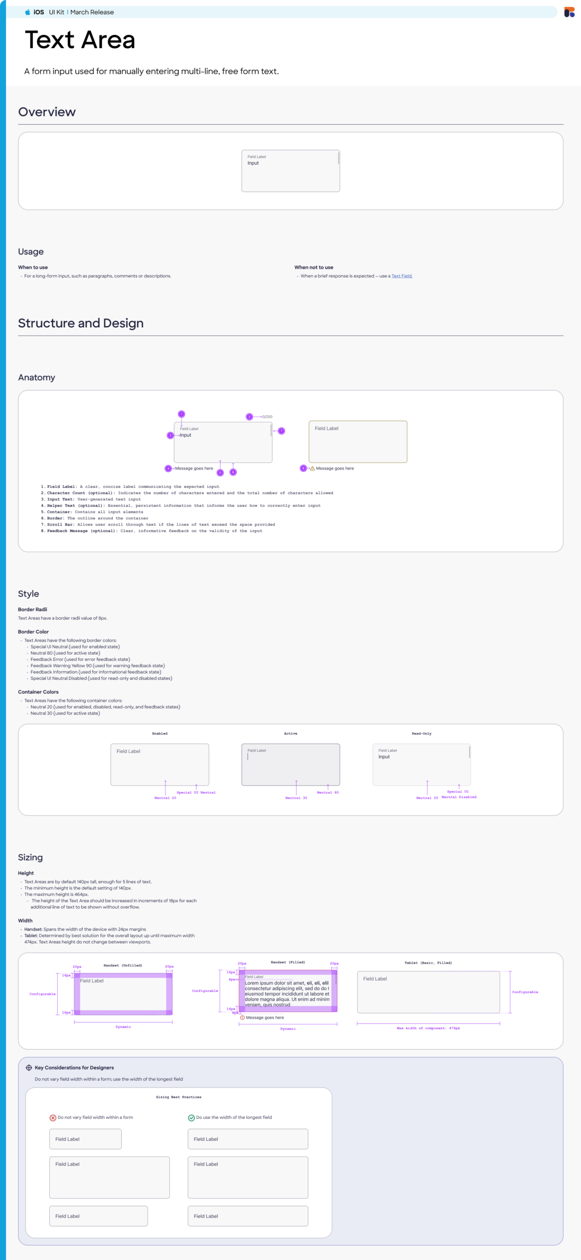
- Height of the text area
- Resizable input field
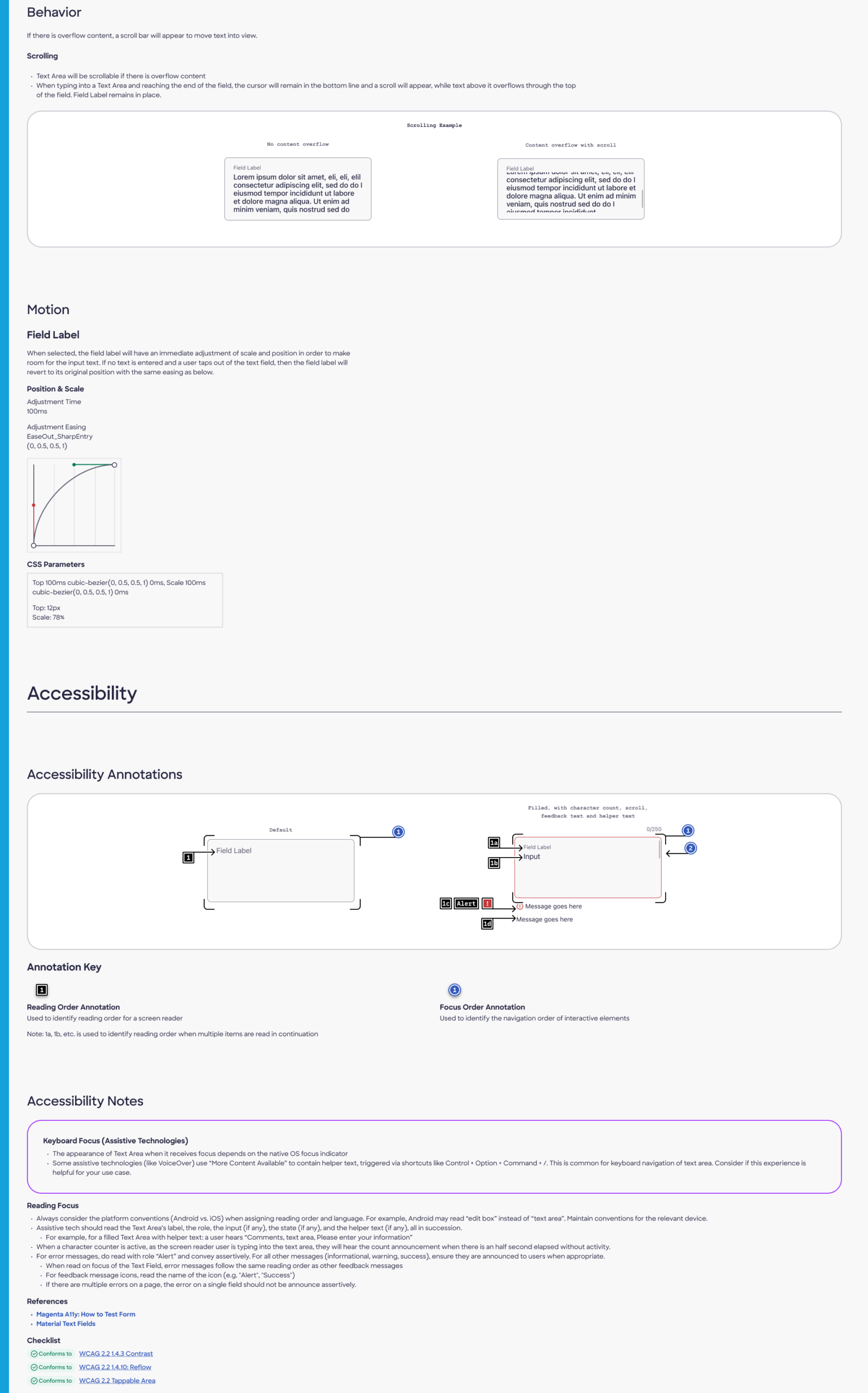
- Scroll bar behavior
- Screen reader compatibility
- Accessibility compliance
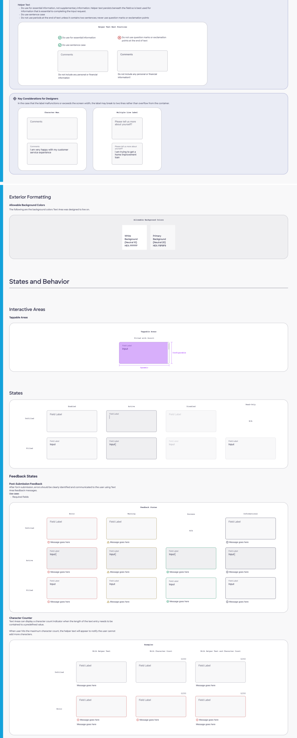
- Character counter and placement
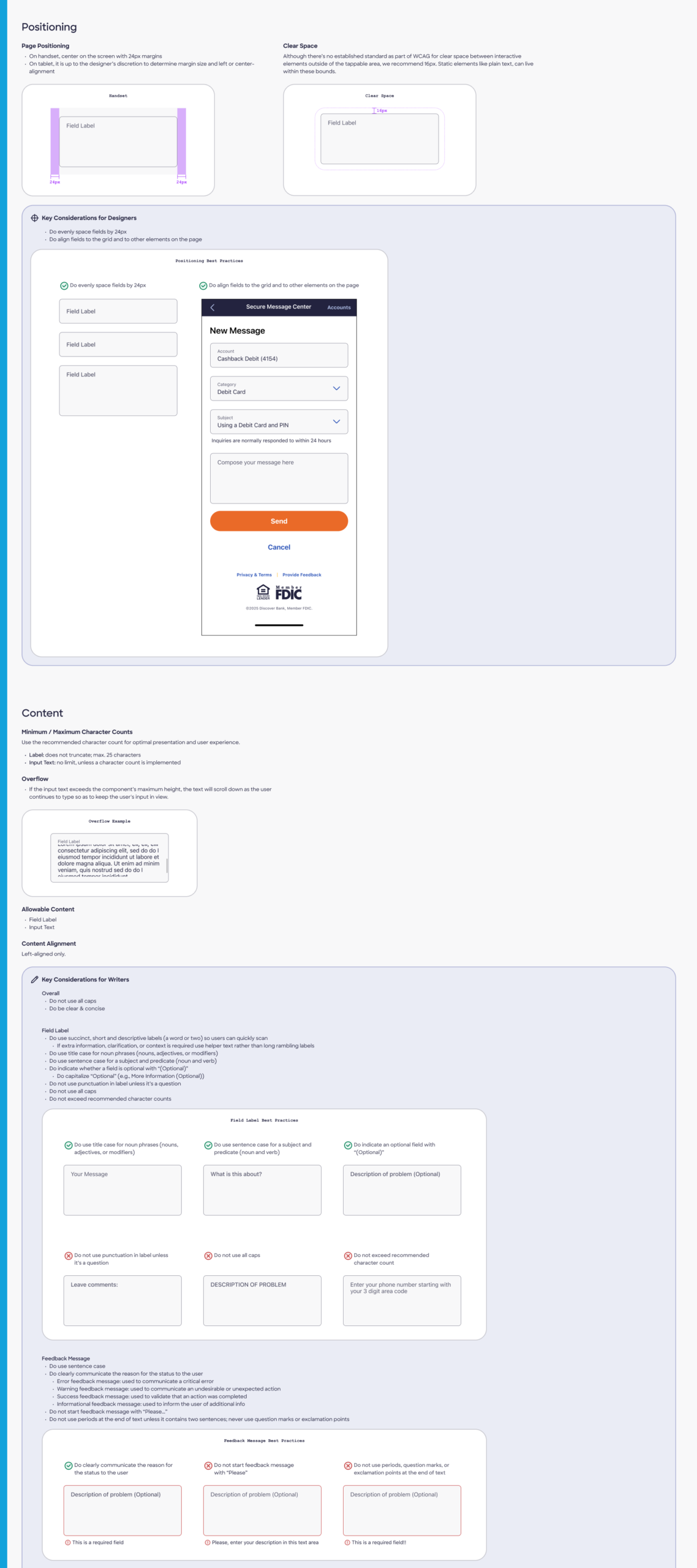
- Labels, alerts, and states
Research-Based Recommendations:
- Height: Build the text area at a recommended height of 136px (to accommodate 5 lines of text). Provide designers with a range to adjust the height to meet their design needs.
- Screen Reader Recommendations for character counter:
- Instead of reading “0/300,” which is our current design, it should read as “You have 200 characters remaining” for clarity.
- Implement a counter announcement with pauses during typing to avoid overwhelming the user.
- Scroll Behavior:
- Add a vertical scroll bar for overflow text.
- When the text size increases for readability, the text should expand inside the container without a horizontal scroll bar.
- Avoid using both vertical and horizontal scroll bars simultaneously, as this can cause accessibility issues.
Findings / Recommendations for Future Enhancements:
- Change the counter format from “0/300” to “300 characters remaining.”
- Consider moving the character counter inside the text container, in the bottom-left corner, to improve accessibility.
- Explore expanding the text area for both web and mobile contexts.
Text Area component documentation